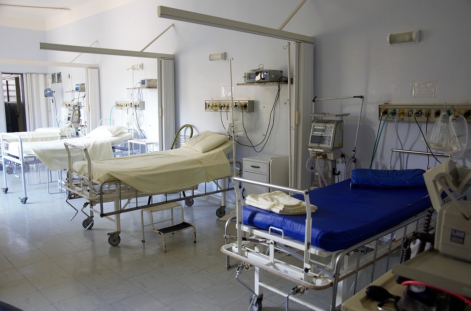
Hospitals have Rooms to Improve

Watch any old black and white movie or early 20th century period flick involving a hospital setting, and there is one common theme: a ginormous room with rows of beds. Millennials might snicker at this Henry Ford, assembly line approach to health care, but there may be something to be said about how it was done in the old days.
There might be a connection between the designs of hospital rooms and the quality of care. A New York Times article reported about a study by Princeton that produced data suggesting there is a strong correlation with a patient’s surroundings and how quickly they heal and improve.
In New Jersey, the University Medical Center of Princeton (UMCP) realized earlier this decade it had badly outgrown its dated home. A new patient setting was needed. It was the perfect time to test the theory, so management elected to design a mock patient room for a controlled experiment.
To properly design the modern medical room for patients, UMCP staff members and patients were surveyed. Physicians and nurses spent months sticking Post-it Notes all around a model room set up in the old hospital. The result: a one-patient room with a big fold out sofa for guests, a view outdoors, a novel drug dispensary and a bathroom positioned in a safe, accessible spot.
The “guinea pigs,” in this case real human patients, were moved in from the surgical unit. Other patients who had similar surgeries were sent to the old rooms. Surveys and medical reports were tabulated. The results have caught the attention of many CEOs of hospitals.
After months of testing, patients in the model room rated food and nursing care higher than patients in the hospital’s old rooms did even though the meals and care were the same. But the real eye-opener was the fact patients in the model room asked for 30 percent less pain medication.
This is obviously important because reducing pain faster can accelerate recovery and rehabilitation. This may lead to shorter patient stays, reduce costs and decrease the risk of accidents and infections. In the new model era of financial reimbursement by quality, not quantity, the statistics of the room’s affect cannot be ignored.
When the new $523 million, 636,000-square-foot UMCP hospital opened in 2012 on its leafy campus, the model room was no longer a fantasy and proved to be successful. The proof is in the pudding as the ratings of patient satisfaction jumped from the 61st percentile pre-move to the 99th percentile in the new room digs. Furthermore, infection rates and the number of patient accidents decreased to all-time low percentages.
Many U.S. children’s hospitals have taken steps this century in creating buildings that from the outside appear “cool” as well as soothing to young patients. These buildings even have lobbies more likely to be found in a modern hotel than a medical center. The next step has been for architect firms to take the strategy down the hallway to the actual patient recovery rooms. The largest hurdle for hospital CEOs and board of directors has always been the upfront building costs. However, with models showing the long-term savings in dollars and sense, the buy-in for modern patient rooms is now a reality.
It is not an easy undertaking for architects to design the space, as hundreds of decisions, big and small, go into configuring a modern patient’s room. First, the hospital rooms should be singles, making double rooms a relic of the past. Research has shown patients sharing rooms provide doctors with less critical information especially if the medical roommate has visiting guests during the doctor’s rounds. Ample space is provided to visitors, as studies have shown family and friends being present speeds the patient’s recovery. My mother’s hospital room in The Villages Hospital in Florida had a side room with a sleeping sofa, sink and a small dining table and chair.
A no brainer for every hospital room is large windows since natural sunlight and a view of the outside has proven to be a large morale booster for patients. With flat screen TV technology, additional soothing viewing may be easily attained by patients. Imagine a patient selecting their tranquil viewing desire: a peaceful, tropical beach with lapping waves, a forest with a babbling brook or perhaps a snow covered mountain peak.
One clever design decision UMCP made was putting a sink in plain sight of the patients where nurses and doctors wash their hands. A second sink is in a bathroom, strategically located right near the bed with a handrail linking bed and bathroom to prevent falls.
Another bonus of new designs is making hospital rooms “same-handed’. Older hospitals have adjacent rooms that are “mirrored” because they share a head-wall, which requires equipment and attachments at the mercy of the design. While mirror rooms are cheaper and space savers, this model’s only option is to have everything in each room reversed in comparison to its adjacent room. This mirror effect increases the chance that medical personnel will make a mistake when reaching for buttons or equipment. Studies have shown medical errors were the third most frequent cause of death in the United States, according to The New York Times.
While hospital “Smart Rooms” have shown to help in recovery time, it is important to remember these buildings and layouts do not cure disease. But new steps not involving drugs that hospitals can take to speed up the recovery process is always a welcome relief to doctors, patients and family.
